Enhanced a rewards program, leading to a 740% increase in user engagement

Background
All Singtel Postpaid customer can enjoy free Rewards on My Singtel app. If a customer wants to enjoy more telco and partnership benefits they can either subscribe to a Red membership (at $40/year) or become a Prestige member (with qualifying spend).
Problem
- Reward users are not actively engaging due to lack of content.
- Current offers are hidden and not visible.
- Perception that users are required to be a Red member.
- Lack relevance of Red membership to their daily lifestyle.
Achievements
- +740% monthly active users
- +54.5% page views for deals catalogue in 3 months
- +40% click through to partner deals in 3 months
Project duration
2023, 3 months
My role
Design lead
Key skills
- Research
- Workshop facilitation
- User experience
- Design system
- Service design

✏️ Takeaway #1
Reward space is highly saturated and competitive

⬆ Above: Previous design of Rewards on My Singtel app
Finding our competitive edge in rewards space
Almost a year after the launch of Rewards on the My Singtel app, we found that user engagement was below expectation.
As the new design lead for Rewards, my challenge was to figure out how to make our rewards stand out in the rewards space.
Before starting the design process, I worked with our researchers to plan our approach:
1. Desktop research – to establish the baseline for rewards and to conduct a heuristic evaluation of our competitors’ strengths and weaknesses, to find out how we can position ourselves effectively in the market.

⬆ Above: We covered both telco competitors and non-telco rewards app for our desktop research.
2. Qualitative user research – since desktop research is assumption-based, qualitative research can help us find out what users think of our rewards, what their expectations are for rewards from a telecommunications company, and identify areas where we are falling short.
Key insights about reward programs:
- Usage and engagement with rewards and loyalty platforms are largely contextual.
- Notifications via SMS and email can serve as effective CTAs if done in a timely manner.
- Users gravitate towards platforms that offer users relevant deals & rewards and provide instant gratification.
- Singtel Rewards does not convey relevant value to customers; even among RED members.
- Offering telco related benefits as a USP while partnering merchants with mass appeal may increase perceived value for RED.
Key problems based on our current rewards design:
- Reward users are not actively engaging due to lack of content.
- Current offers are hidden and not visible.
- Perception that users are required to be a Red member.
- Lack relevance of Red membership to their daily lifestyle.
These key insights we obtained from qualitative research played a significant role in the subsequent process when I collaborated with stakeholders to finalize the brief and gather requirements.
✏️ Takeaway #2
Educating stakeholders help to increase value of UX and you as a designer
After receiving the research findings, we shared them with our stakeholders along with the next steps, which included gathering requirements.
Following my previous requirement gathering workshop, my stakeholders provided feedback that they found the workshop helpful. They attempted to implement the same approach within their team before sharing the requirements with me.
It was better this time but there was still room for improvement. As it turns out, 3 separate initiatives lumped together as a requirement. So we still need a workshop to clarify and align the requirements further.

⬆ Above: Requirements from my stakeholders with a little bit more details on business pain points .
Introduce problem statements to frame their mind on the problem, not solution
This time round I ran the workshop a little differently, the goal is to cultivate the thought process for a problem statement instead of giving requirements as solutions. I gave an introduction to what a problem statement is and got the stakeholders to try it out. Next, we briefing combed through the post-its shared by stakeholders previously to ensure they aligned with the problem statement.
In a separate session, we went into details, clarifications and prioritisation.

⬆ Above: Output from my Rewards requirement workshop

⬆ Above: Problems statements constructed based on research findings and pain points.
After this, it helped me to establish myself as the go-to person for seeking help even before new project kickoff. I was able to review the requirements to ensure they made sense and influence which key performance indicators (KPIs) made sense for the initiative.
Design principles crafted from users' needs and business goals

⬆ Above: Design principles for Rewards
Now that we have our problem statements, the next step is to establish design principles before we start our design process. When uncertain about user experience, this is the guideline to refer to.
✏️ Takeaway #3
Make better-informed design decisions backed by research
Change the perception that Singtel Rewards is for Red Members only
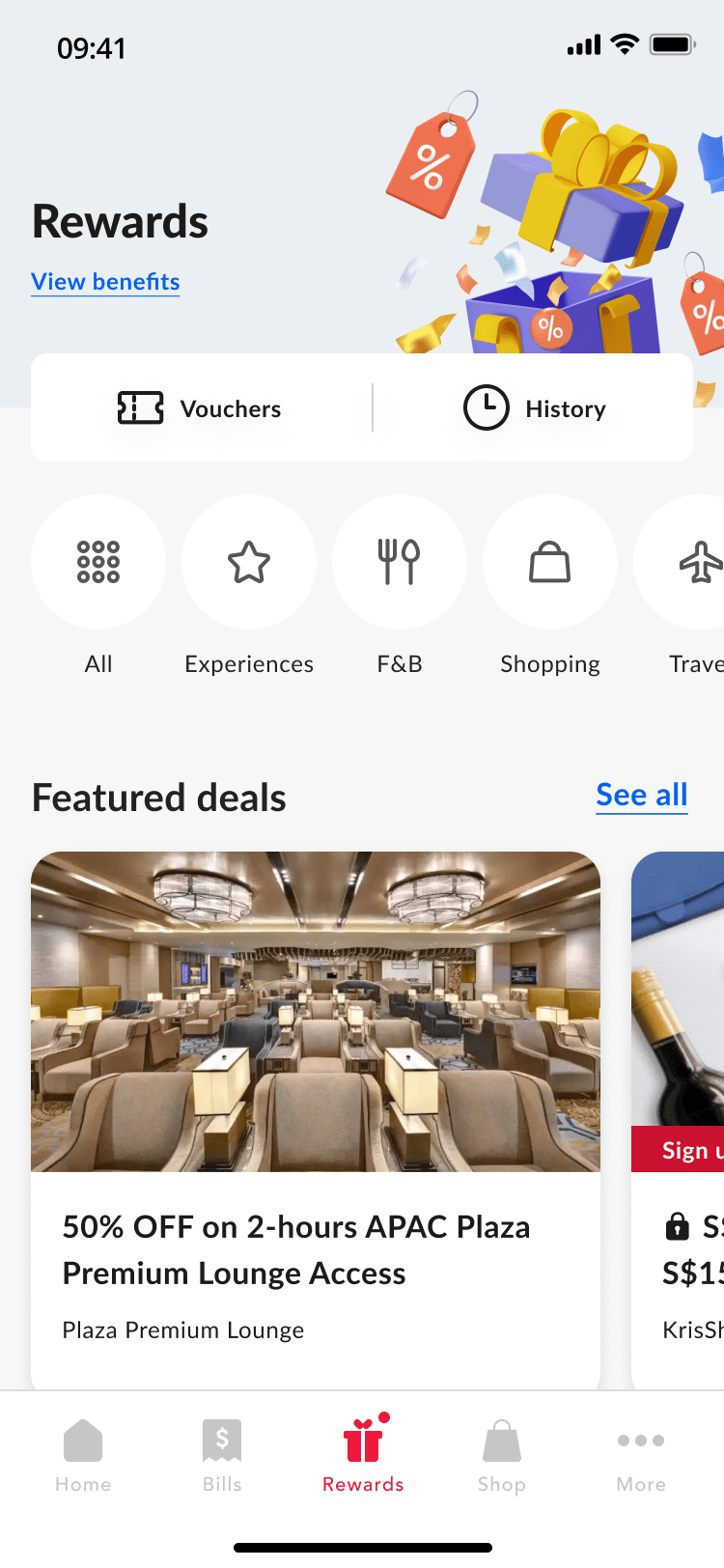
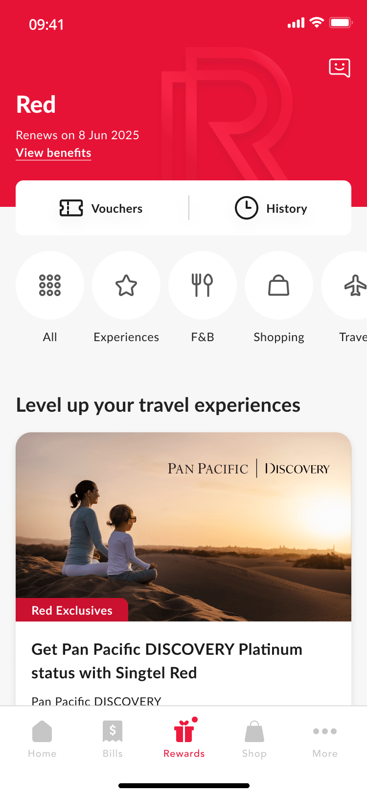
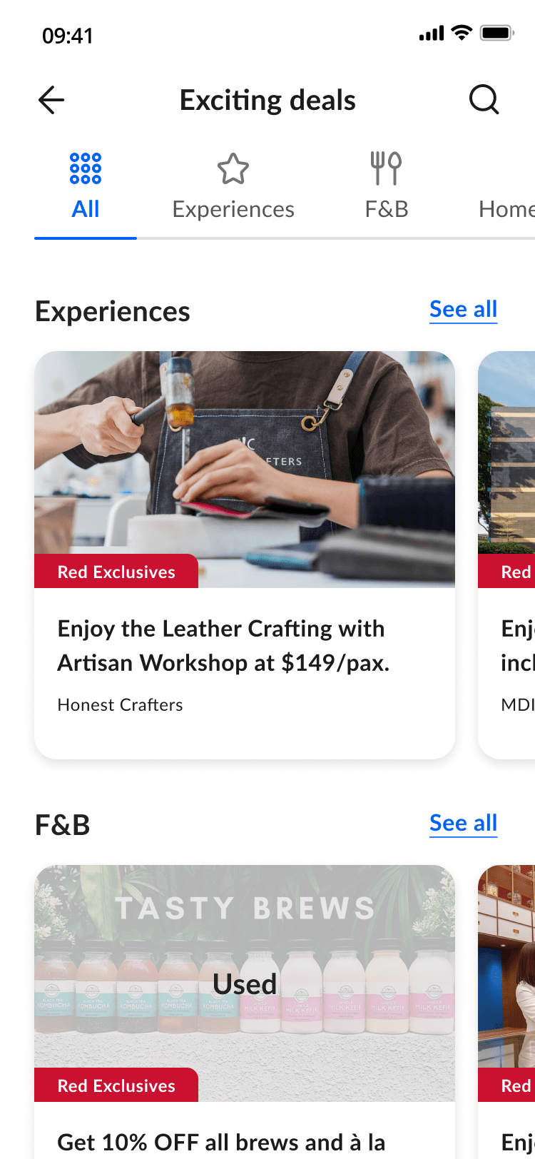
We made improvements to the dashboard based on insights. We increased the amount of content and displayed deals upfront and de-prioritized the banner to upsell red membership (which used to take up about 40% of the screen) and focused more on user’s current entitlement.
Afterwards, we conducted a round of concept test with this dashboard and overall the dashboard’s Information Architecture (IA) fits users’ expectations and they understood the key features.

⬆ Above: Improvements made to rewards dashboard based on user insights.
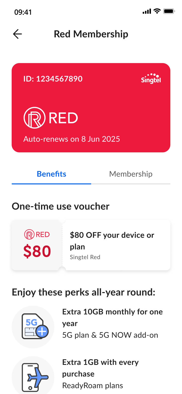
We’ve improved view benefit page for all reward members to ensure they understand and make use of their benefits. By placing the member benefits side by side, users can easily compare our memberships.

⬆ Above: Consolidated view of all the membership benefits
Increase the perceived value of Red Membership
Based on research, users didn’t see the benefits of Red Membership deals because they could already access some deals without it. To address this, I suggested enabling a preview of Red deals to show users what they’re missing and encourage them to sign up for Red Membership.

⬆ Above: Giving users a preview of what they are missing out and to encourage conversion
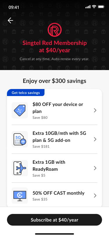
On the “Buy Red Membership” page, we also implemented some improvements. We made the value proposition clearer and reorganized the content based on user preferences – giving priority to telco benefits, followed by merchant deals and then priority services.
Users can now tap on the benefits to view more details. Our research shows that users want to learn more about the membership before making a purchase, especially the terms and conditions of the $80 voucher.

⬆ Above: Comparison of the old and new design of Buy Red Membership page.
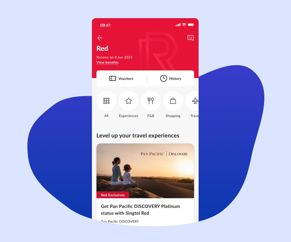
What was launched
View it live on My Singtel app – download the app and redeem rewards at your fingertips!