Redesigned the app experience and increased top-up revenue by 150%
Background
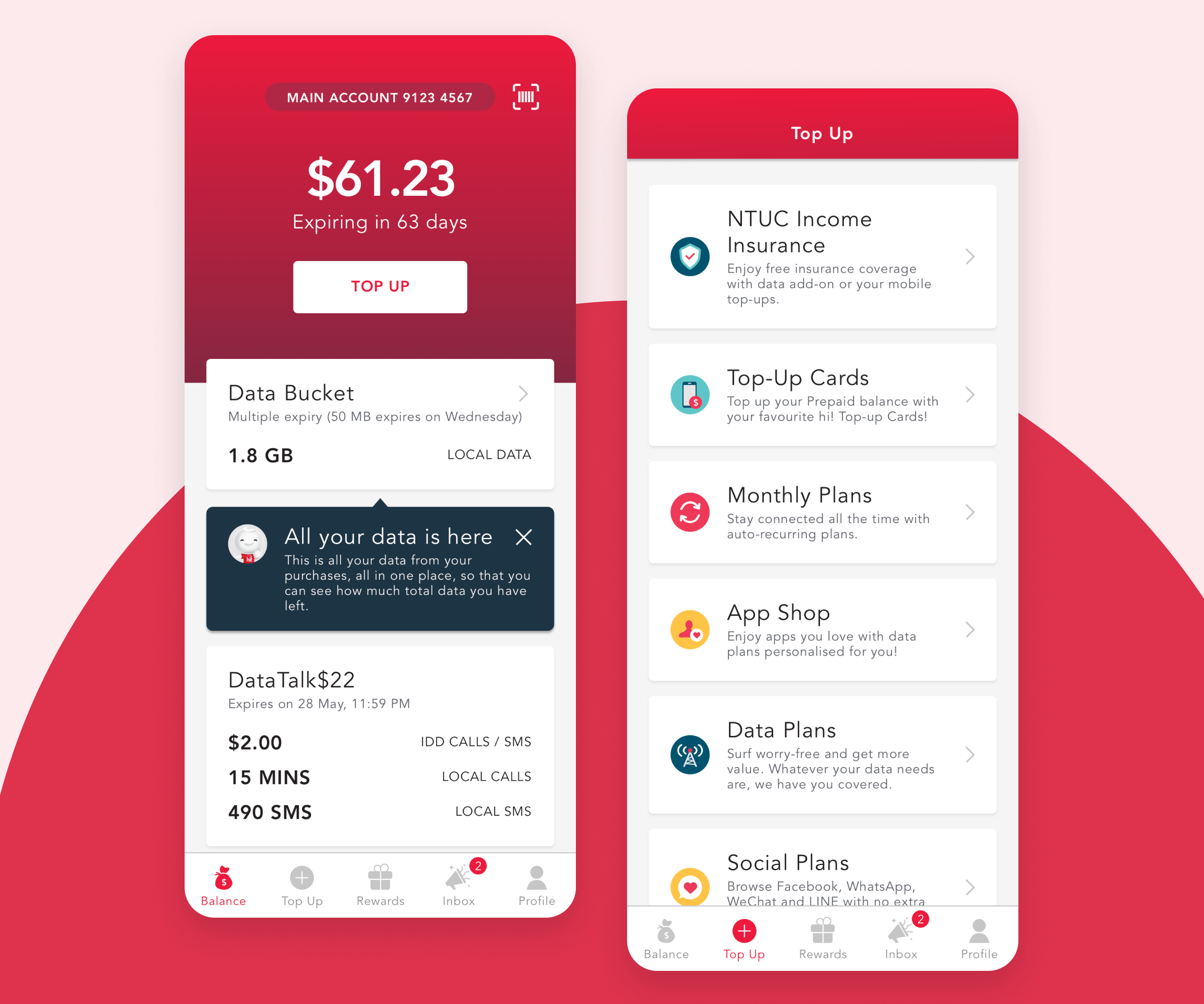
To redesign Singtel’s Prepaid app for iOS and Android and to include additional features with the aim of providing a better experience and improve engagement. The existing app design was long overdue, outdated and was not built with a mobile-first approach.
Goal
Create the best Prepaid app experience in Singapore that changes the customers’ top-up behaviour from retail to digital self-help.
Achievements
- Rated #1 “Top Free Tool” in Google Play Store (2019)
- Awarded CEO Quarterly Team Award in 2016 and 2017
- Awarded “Best in Digital Excellence” in Singtel Group COE EAGLE Awards 2018
- +250% monthly active users
- +150% top-up revenue
- 4.6 stars rating in App Store
Project duration
2017 – 2021
My role
From Visual Designer to Design Lead
Key skills
- Research
- User experience
- Design system
- Lottie Animation
- Workshop facilitation

The problem
Most users have a strong mindset to stay status quo. Hence, the biggest challenges were designing a desirable digital channel for the Prepaid base and changing our customers’ top-up behaviour.
Before the design sprint began, we conducted 2 rounds of user interviews to find out the behaviour and mindset of Singapore’s Prepaid base. Our insights indicated users were unlikely to change from their status quo, citing these reasons:
- Better deals and assistance from distributors or roadshows.
- Satisfied with relying exclusively on SMS to find out about their prepaid balance.
- Reluctant to use digital channels for top-ups as they were unsure what they were buying.
- Sense of familiarity and security by using the same top-up method for years.

⬆ Above: How Singtel Prepaid app looked like before the redesign.
✏️ Takeaway #1
Using design system to unify and create a consistent experience
This design system is built with scalability and consistency in mind, to enable quick wireframing, and development for new plan rollouts. With increased consistency, reduced design debt and handoff times, the design system lived up to its name and mission as it continues to be built. Prototypes for concept tests could be completed as fast as 2 weeks and quicker go-to-market time with lesser development time.

⬆ Above: A glimpse of components built into the design system
Simplicity and consistency help users become familiar with the new UI quicker
It’s better to repurpose existing templates and flows instead of reinventing the wheel for every new design, which would require users to relearn things. As I shared earlier, user insights indicate that the Prepaid base has a strong sense of familiarity and security.

⬆ Above: A consolidation of flows and page templates built into a master file as a shared resource.

⬆ Above: Design pattern for the purchase flow – any new initiatives that have purchase flow may have content or copy, as long as it follows this framework.
✏️ Takeaway #2
It's possible to do usability test even without a research team
Despite not having a research team, we facilitated the usability test with 12 users. We have a diverse group of customers in our Prepaid base of about 10 different nationalities. Hence, we needed to find out if there were any gaps in the experience or any confusion with the language used.
To understand:
- Usability of check balance and top-up flows
- Task completion efficiency
- User expectation
To identify:
- Areas of opportunity
- Understandability of the language used (English is not the first language for most Prepaid customers)
Key takeaways:
Overall, users found the app very easy to use and a significant improvement over the existing app. However, there was still room for improvements to be made.

⬆ Above: User insights from the usability test facilitated by the design team.
A glimpse of iterations that were made for our first release

✏️ Takeaway #3
Participation in research is as important as design
It took me about 2 years to truly empathize with Prepaid customers. Coming from an agency background, interacting with real users and conducting user research was new to me.
Having gone through numerous qualitative research and ethnography sessions has helped me understand the diverse backgrounds of prepaid customers and their mindsets.
Each had unique challenges ranging from language barriers to varying levels of education and technology literacy.
As a result, I became more confident in expressing user perspectives backed by data and identifying initiatives that didn’t align with our users.

⬆ Above: Personas created based on common groups identified from the ethnography I had lead with a researcher.
Post-launch results
217
App Downloads
180
Monthly Active Users
1
Free Tool in Play Store
Reflections
During my time on this project, I had many new and exciting opportunities. I designed a complete app experience from start to finish, learned about UX, created a design system, conducted usability testing, performed guerilla testing on the streets, planned for ethnography, transitioned from Waterfall to Agile methodology, gave presentations to stakeholders, worked closely with developers, and even took on the role of lead experience designer.
I am grateful to my bosses and managers for trusting me with these opportunities and to my colleagues for their guidance in UX and research.