A medical app that can save lives with first response
Background
It is estimated that approximately 3.4 million adults have undetected irregular heartbeats. Failure to detect early signs could lead to fatal consequences, particularly for elderly women who are at higher risk.
With today’s technology, it is possible to extend life by detecting abnormal heart readings early and reminding patients to take their medication on time to manage existing conditions. Every second is crucial in saving lives.
Challenges
Our primary target audience is elderly individuals aged 50 and older. While over half of them own a smartphone, many find it difficult to keep up with smartphone technology. Therefore, the app design needs to be simple and familiar to accommodate the potential challenges elderly users may face when interacting with the interface.
Goal
To create a mobile app for Atrial Fibrillation patients, providing medication advice, scheduling medication alarms, inputting dosage information, reporting side effects, sharing data with doctors, and alerting caregivers when safe dosage thresholds have been exceeded.
Project Duration
2015, 2 Weeks
My Role
Visual designer
Key Skills
- Research
- User experience
- Visual design
- Prototyping

Persona created based on medical research
Before the project began, research decks were provided. These decks contained a lot of medical jargon that I found difficult to understand. This led to several rounds of clarification with a medical student to explain the terminology.
As a result, I created a persona to better understand the audience for whom we are designing the app.

⬆ Above: To give the team a better understanding of who we are targeting and increase the value of the app.
Plan out key flows and information architecture

⬆ Above: Planning out key features the persona will likely use.
Based on our research, we anticipate that our target audience may encounter challenges in learning to use the new app.
As a result, I decided to keep the user flow simple so that users or their caregivers can easily set up notifications and allow the app to run in the background.
Data on the user’s health will be sent to their doctor without requiring the user’s active involvement.
Sketches to mockups
In our discussions, I drew some designs to illustrate the idea of the features. I also emphasised the importance of making sure that the instructions provided on the app are simple and easy to understand, with minimal steps to complete tasks.
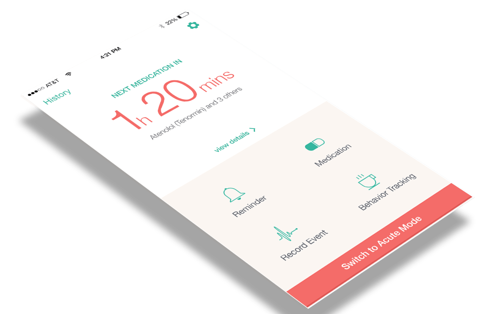
For example, the main feature of the app is a medication reminder. To see when the next medication should be taken, it should be easily visible and accessible with just a few taps.

⬆ Above: Some sketches to quickly communicate ideas and clarifications
Mockups to finalise the idea
After alignment with stakeholders, the mockup was digitised for presentation. Several key screens were created to finalise the look, feel, and colours.

⬆ Above: Key screens before adaption for the rest of the screens.
Style guide to ensure consistency
After the key screens were approved, I created a style guide for handover to the developers. This also helps to ensure consistency in the UI, in the event another designer were to take on this project in the future.
⬇ Below: Guidelines for fonts and spacing used

⬇ Below: Components and icons library

Alright, here’s the showcase!

Reflections
The design process was enjoyable, even though the project didn’t ultimately launch. It was exciting to work on something different and related to medicine. Since the project was heavily research-based, I felt like I could create something helpful for society. Despite the challenge of understanding medical terms, having a medical student as a buddy to help explain things was reassuring.