Transformed a reservation app and improved rating by 50%
The brief
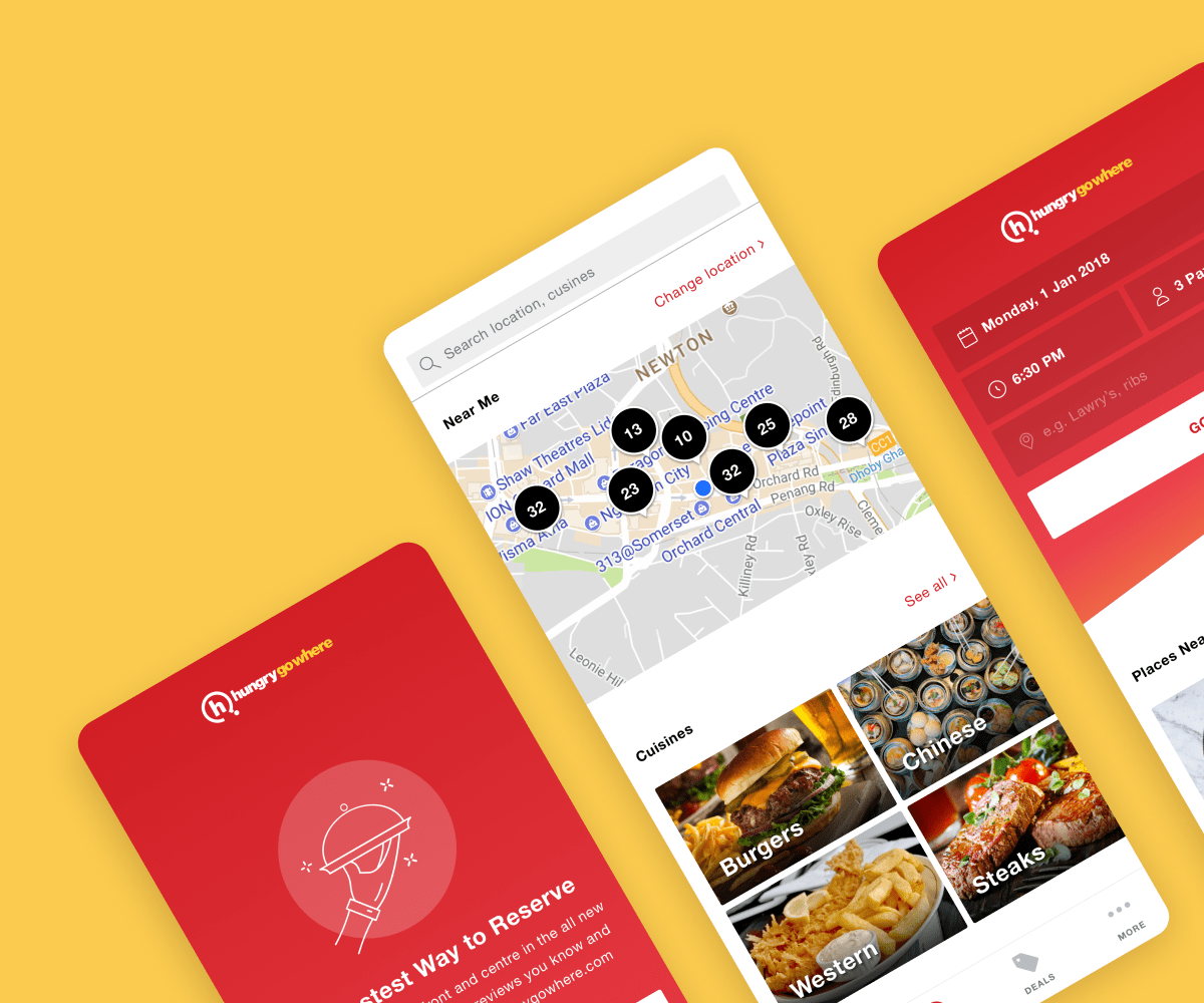
To deliver an app that is reservation focused with an aim of increasing the average reservation per user from 1 reservation to 3 reservations per year.
Problem
Low app ratings resulted from:
- Outdated database – many restaurants no longer take reservations or have closed down.
- Search displays irrelevant results.
- Lack of valuable information – such as menu are not displayed.
- Slow loading app
Achievements
- Awarded Bronze for UIUX – Asia eCommerce Awards 2019 Singapore. Competing against finalists such as Tata Group, Mondelez and Love Bonito.
- Awarded Silver for Best in eCommerce (eRetailer) – Asia eCommerce Awards 2019 Singapore
- Doubled the number of seated diners in 6 months.
- Increased 7.1% of MAU in 6 months.
- Improved App Store rating from 1/5 (Jan 2018) to 3.7/5 (Jan 2019).
Project duration
2018, 6 weeks
My role
From Visual Designer to Design Lead
Key skills
- Research
- User experience
- Design system
- Lottie animation

✏️ Takeaway #1
Research can be done in many ways, even without a research team
Having some research is better than none. Here are some methodologies we tried to gather as many insights as possible.
Expert review of the current app
We were not the app’s original designers, so we could review it from a neutral perspective. Alternatively, getting a fresh pair of eyes helps to provide a neutral evaluation.

⬆ Above: How the app looks like before the redesign
👍🏻 The Good
- Important information surfaced.
- The reservation flow works as intended.
- Consistency with Design System.
- Results listing caters to users on different journeys (relevancy, distance, popularity).
✍🏻 Could be improved
- Too many prompts showing without context.
- The home screen attempts to do too much and is not guided for the user.
- Navigation is hidden and provides an overwhelming number of options.
- The presence of Google ads makes the app look scamy.
- The restaurant detail page is text-heavy and doesn’t include menus.
- Reviews often re-direct users outside the app.
- No quick way to view upcoming reservations.
🗣 Make use of App Store reviews
“Places are not updated, navigation around app getting complex.”
“Does not even show accurate results”
“Google search is much faster and better.”
“The web pages that I received is more useful than the app itself. Tell me how to search for Japanese hot deals from your apps? I get entirely a different setup from the webpage.”
“I booked a restaurant, went and found it closed for renovation??? Why still accept booking?”
Download competitors' app to conduct landscape review
They are mostly free to download, and going through the actual flow of competitors’ apps also enabled us to experience micro-interactions, which helped to form a more detailed evaluation.

⬆ Above: Key findings from our landscape review on both local and global competitors
✏️ Takeaway #2
Learning the ropes to become an experience designer
At the beginning of this project, UX was still unfamiliar to me. With the guidance of my UX mentor, I was able to learn through hands-on experience, which ultimately boosted my confidence to take the lead on the project as it evolved and matured.
Establish the design approach and core principles before design
These guiding principles were mainly formed based on our research key findings. When uncertain about user experience, this is the guideline to refer to.
Speed
Delivering the core reservation flow in the fastest possible way to allow the most seamless experience
Simplicity
Reducing complexity and improving clarity with the language we use, the way information is organized
Relevance
Anticipating the three main user journeys (reservation, discovery, deals) and guiding users no matter their starting point
Scalability
Ensuring the designs are future-proof and sufficiently robust to anticipate the fast- changing business needs
Planning a few steps ahead with atomic design
Embracing Atomic Design really opened up my thinking to see the bigger picture. It got me flexing my logical muscles and focusing more on functionality rather than just visual appeal. I shifted my mindset from obsessing over whether a page looks pretty to questioning if the flow actually makes sense.
Behind the scenes, there’s a lot of groundwork involved in planning, mapping out different scenarios, and developing components that are scalable and reusable. This thoughtful planning process ensures that the design system is adaptable and resilient, ready to meet various needs seamlessly.

⬆ Above: Snippet of the design system for HungryGoWhere
Design improvements
With our design improvements, our reservation flow is now up to 37% faster than our competitors and 39% faster than our old app.

⬆ Above: Some of the design improvements made
We made it!
Awarded Bronze for UIUX
Asia eCommerce Awards 2019 Singapore
Increased by 7.1%
Monthly Active Users


Awarded Silver for Best in eCommerce (eRetailer)
Asia eCommerce Awards 2019 Singapore
From 1 to 3.7 stars
App Store rating